iOSification, continued
The term iOSification is quite accurate in describing a recent trend in Mac user interface design. First used by One Thing Well (September 2010), as far as I’m aware of. It describes a trend of which I’m not sure how big it will get.
But to begin: Actually, I’m fiddling around with a Cocoa project (more to come.., nothing email related, though) and had have some trouble in designing the user interface. I started with Apple’s Human Interface Guidelines but these seemed old-fashioned to me, though I couldn’t (and still cannot really) tell why. One reason could be that the iOSification trend has already got me.
iOSification: More and more new Mac software doesn’t really stick to the “rules” but facilitates a “free style” borrowed from iPhone and iPad design. This is visible in the Courier App (the boom of the term “app” is another evidence of this trend) as described by One Thing Well, but to be also found in other software genres.
For example, take email software for Mac: In the beginning, there was (and is) Apple’s Mail.app. In recent times there was Postbox (first presented in 2008, it still being a “desktop email application”) and more recently there is Sparrow (rather new, it is already an “app”, if we believe the hyperlink). Let’s just take the default screen design of the list of e-mail messages in a given folder. I compared Mail.app for Mac and Postbox with Mail.app for iPad and Sparrow. This is good old Mac Mail.app:

This is old school, but in line with the HIG. Not very cool, actually, but it works and is even functional. Let’s then have a look to Postbox:

On the basis of Thunderbird, but very similar to Mail.app: A classical table structure with rows and columns. Just in contrast to that, the iPad Mail application (which somewhat resembles Microsoft Outlook’s inbox list of messages):

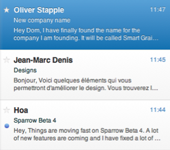
There is no multi-column table design anymore, no unused column space, but a kind of multi-line, one-column list. To remember this: This is an iPad app. Now see the inbox message list of Sparrow, the fall 2010 E-Mail app for Mac OS X (not: iPad):

The similarity is striking. To be honest, Sparrow’s interface looks much more appealing to me than the classical Mac list/table interfaces. It is leaner, cleaner. This is just one example, more could easily be found, I’m sure of that. Speaking of functionality on a Mac, it is perhaps a different thing: How to sort the list by subject? In the classical table design, one could just click on the column header. Here, it is difficult to tell, use the menu? To just take iOS elements and to port them to OS X brings up some more questions.
Is this just the beginning? What does that mean for my Mac software project? Shall I ride this trend? Or stick to the good old Mac HIG? Will this trend lead to a unification of OS X and iOS, at least in terms of user interface design, in the end?
Update: Today’s rumors say that the upcoming OS X 10.7 will utilize some cool user interface elements of iOS – if this isn’t a hint which way to head for..